
Reading the Retention Graph Like an Editor
How to read retention graphs like an editor and spot what is actually working.
# Reading the Retention Graph Like an Editor
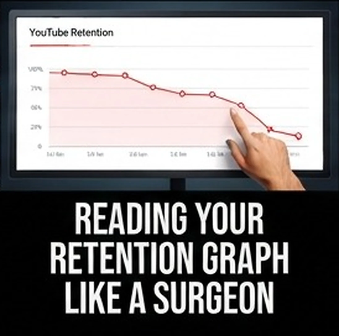
The retention graph is the most useful diagnostic tool a faceless creator has, and it is routinely reduced to a single glance at the average view duration number before the tab gets closed.
The number tells you whether the video worked. The shape tells you why. Learning to read the shape is the difference between guessing at improvements and knowing exactly which fifteen seconds broke the video.
The first thirty seconds decide everything
Every video loses viewers immediately. That opening drop is normal and unavoidable, because a portion of every audience clicked on a misunderstanding and leaves as soon as they realize it.
What matters is how steep the drop is and where it flattens.
A gentle slope that levels off means the opening delivered on the thumbnail promise and the people who stayed were the right audience. A cliff means something in the first few seconds contradicted the expectation the packaging created.
The specific causes are worth memorizing, because they recur constantly. An intro animation before the content starts. A narrator restating the title. A slow scene-setting paragraph before the first interesting fact. Audio that sounds noticeably different in quality from the sidebar video the viewer just left. Or a first line that promises what is coming instead of delivering something immediately.
Fixing the opening is the highest-leverage edit available on any faceless channel, because it applies to every future video at zero additional cost.
Sharp drops in the middle are edit problems
Once past the opening, the graph should decline gradually. Any sudden vertical drop in the body of the video marks a specific failure at a specific timestamp, and you can go watch it.
Play the fifteen seconds before the drop. The cause is almost always one of a short list. A section that repeated information already covered. A digression the viewer did not sign up for. A long stretch with static or repeated footage. A tonal shift, often a sponsorship or a call to action placed badly. Or the promised payoff arriving early, which resolves the tension holding the viewer in place.
That last one catches experienced creators. If your video promises to reveal something and reveals it at minute three, the graph falls off a cliff at minute three, and the remaining seven minutes of good content go unwatched. Delivery timing is a retention decision, not just a structural one.
Gradual decline with no drops means pacing, not content
Sometimes the graph shows no obvious cliffs, just a steady slide that ends with poor overall retention. This is harder to diagnose because there is no single moment to blame.
That shape usually indicates pacing. The video is fine but slow. Points take too long to arrive, sentences carry more words than they need, and the visual rhythm does not change often enough to reset attention.
The fix is compression rather than rearrangement. Cut ten to fifteen percent of the runtime by removing restatement, trimming setup, and deleting anything that does not either advance the story or add information. Faceless videos are almost never too short. They are frequently too padded.
Rises are the most valuable signal on the graph
A section where retention climbs is telling you something specific about your audience, and it is worth more attention than the drops.
Rewatched or shared segments mean the content there was strong enough to pull people back or forward. Look at what type of section it was. Was it an emotional beat, a surprising fact, a direct comparison, a piece of original analysis, or a well-edited sequence.
Whatever it is, make more of it. The pattern of where viewers climb across a dozen videos is effectively your audience telling you what channel they want you to be, in a language more honest than comments.
Read it against the right benchmark
Retention percentages are not comparable across video lengths. Fifty percent average retention on a four-minute video and fifty percent on a twenty-minute video are enormously different achievements.
Compare each video against your own previous videos of similar length and format. Your own baseline is the only benchmark that means anything, and improvement against it is the actual goal.
Turn the reading into a routine
After every video passes its first week, open the graph and answer four questions. Where is the first significant drop and what is happening there. Is the overall shape a cliff, a slide, or a healthy curve. Where did retention rise and what caused it. And how does this compare to the last three videos of similar length.
Four answers, ten minutes, written down somewhere you will see them before writing the next script.
Do that consistently for two months and you stop guessing about what your audience wants. The graph has been telling you the whole time.